10 Best Practices for Fashion Store Product Grid Design
Learn how to design effective product grids for fashion stores with best practices that enhance user experience and boost sales.
Jakob, probably one of the most remarkable Webflow developers that has ever lived, created this stunning blog post and the highly engineered CMS in the background.

In fashion e-commerce, a well-designed product grid can boost sales, reduce returns, and improve the shopping experience. Here are 10 actionable tips to create effective product grids:
- Set Clear Visual Priority: Use high-quality, consistent images, multiple angles, and lifestyle photos to showcase products.
- Make Grids Responsive: Ensure grids adapt to mobile, tablet, and desktop with smooth navigation and fast load times.
- Balance Spacing: Use proper spacing (e.g., 24px between product cards) to make grids clean and easy to browse.
- Add Quick Views: Let shoppers preview products without leaving the grid, including images, price, and "Add to Cart" options.
- Simplify Filtering: Offer filters like size, price, and color to help users find products quickly.
- Design Hover Effects: Show extra details like alternate images or quick actions when users hover over products.
- Choose the Right Scroll Type: Use pagination, infinite scroll, or "Load More" buttons based on catalog size and user preferences.
- Speed Up Page Loading: Optimize images, use lazy loading, and streamline code to reduce load times.
- Add Save-for-Later Options: Include wishlists or "Save" buttons to encourage return visits and future purchases.
- Leverage Tools Like Depict.ai: Automate grid management with features like smart sorting and stock updates.
Quick Comparison
FeatureWhy It MattersExample/TipVisual PriorityGuides user focusUse 360° views and lifestyle imagesResponsive DesignImproves experience on all devicesTest grids on real devicesQuick ViewsSpeeds up browsingInclude "Add to Cart" buttonsFilteringSimplifies product searchOffer multi-select filtersHover EffectsAdds interactivityShow alternate images or quick actionsScroll TypeMatches user behaviorUse hybrid scroll methods for balancePage SpeedReduces bounce ratesCompress images and use CDNsSave-for-LaterIncreases engagementAdd wishlists with stock alertsAutomation ToolsSaves time and boosts performanceUse Depict.ai for smart grid management
Designing a Clothing Store Collection Page
1. Set Clear Visual Priority
Visual hierarchy plays a key role in guiding customers toward the products they're looking for. A Shopify study found that only 0.52% of consumers prefer a single product photo, while 33.16% like multiple photos, and about 60% favor a 360° view of the product.
Size and Detail Matter
Your product images should showcase important details without overwhelming the design. For example, Home Depot uses large, high-quality images to emphasize product features effectively.
Keep Styling Consistent
Consistency is key. Stick to uniform photography standards across your grid - this includes using the same background, lighting, image placement, and model positioning. A consistent style makes your grid look polished and professional.
Show Products From Multiple Angles
Customers want options. Offer multiple images, including a 360° view, to meet their preferences:
View TypeCustomer PreferenceSingle photo0.52%Multiple photos33.16%360° view60.00%
Highlight Top Performers
Make sure to feature your best-sellers, new arrivals, or products with high conversion rates. This approach can drive more attention to items that are already performing well.
Add Lifestyle Images for Context
Lifestyle photos showing products in everyday settings can help customers understand scale and imagine how the items fit into their lives. This technique is especially useful for furniture, clothing, and decor.
Use Whitespace Wisely
Whitespace isn't wasted space - it helps separate products and draw attention to key elements. According to the Nielsen Norman Group, users form their first impressions in milliseconds. Thoughtful use of whitespace ensures your grid is visually appealing and easy to navigate across all devices.
2. Make Grids Work on All Devices
Responsive product grids are a must for modern fashion stores. Why? Because 63% of consumers follow fashion brands on mobile social media. A well-designed grid ensures a smooth shopping experience, no matter the device.
Use Smart Breakpoints
Your product grid should automatically adjust to different screen sizes. Here’s a quick guide:
Device TypeScreen WidthSuggested ColumnsMobileLess than 768px2 columnsTablet768px–1024px3–4 columnsDesktopMore than 1024px4–6 columns
Prioritize Speed
Compress product images and clean up your code to reduce mobile load times. Faster pages mean happier shoppers.
Design for Touchscreens
Make navigation easy for mobile users. Use thumb-friendly buttons and ensure clickable elements are spaced out. For example, filter buttons and product cards should have touch targets of at least 44×44 pixels - this helps lower abandonment rates.
Test on Real Devices
Testing your grid on actual devices helps catch problems early. Tools like BrowserStack Live give access to over 3,500 devices, making it easy to see how your grid works across different screen sizes and orientations.
Keep the Look Consistent
Make sure your grid feels uniform across all devices. This means using consistent image ratios, spacing, typography, and button placement. As Jake Rocheleau puts it, "Every website should be designed with a responsive approach".
Add Dynamic Features
Take the mobile experience up a notch with features that adjust to screen size and user behavior. This keeps your grid functional and engaging, no matter how shoppers interact with it.
3. Balance Space Between Products
Balancing the space between products is key to refining the user experience and boosting sales. A well-spaced product grid can significantly improve conversions. For instance, a study revealed that doubling the space around jewelry items increased revenue per shopper by 50%.
Use the 8-Point Grid System
The 8-point grid system is a reliable way to maintain consistent spacing in your product grid. Here's a simple breakdown of recommended spacing:
ElementSuggested SpacingBetween Product Cards24px or 32pxCard Padding16pxImage-to-Text Gap8pxText Line HeightMultiple of 4px
This system helps create a clean, organized layout that supports your visual hierarchy and responsive design.
Implement Smart Spacing
- Leverage CSS Grid: Use the gap property to ensure uniform spacing. For example:
.collection .grid { row-gap: 30px !important; }. - Create Breathing Room: Give elements enough space to draw the customer’s focus. Retail expert Kathy Heil explains:
"Cluttered entrances overwhelm customers because it's impossible to focus on anything. When our eyes cannot 'land,' we feel uncomfortable instead of intrigued".
Mobile-Specific Spacing
For mobile users, spacing adjustments are essential to ensure smooth touch interactions and usability:
- Keep product cards at least 44px apart for easy tapping.
- Reduce padding to 12px on smaller screens.
- Maintain a minimum gap of 16px between rows.
- Use relative units like
remoremfor flexible, responsive spacing.
Thoughtful spacing enhances both desktop and mobile shopping experiences, making it easier for customers to browse and engage.
4. Add Product Quick Views
Quick views are a handy feature that allows shoppers to preview products directly from the grid without navigating away. They make browsing faster and more efficient, which is especially important in fashion eCommerce, where the average conversion rate is 2.4%. Let’s dive into how to create effective quick views that encourage purchases.
Key Elements for Quick Views
When designing quick views, include these essential components to help shoppers make informed decisions quickly:
FeaturePurpose2–3 High-Quality ImagesHelps shoppers evaluate products at a glancePrice & Size AvailabilityEnsures customers know if the product meets their needsAdd to Cart ButtonProvides a direct path to purchaseAdd to Favorites OptionAllows users to save items for laterProduct Page LinkOffers access to more detailed information
Why Shoppers Love Quick Views
Research from the Baymard Institute highlights how much users appreciate this feature. One participant shared:
"So I like the 'Quick Shop' option because I stay on that same page without moving to a different page." – Test participant, Baymard Institute
This convenience keeps users engaged and focused on their shopping experience.
Mobile-Friendly Design Tips
For mobile devices, quick views should be thoughtfully implemented:
- Overlay the grid without completely obscuring it.
- Include a clear 'Back' button to make navigation simple.
- Center the quick view to maximize screen space.
- Ensure buttons and interactive elements are large enough to tap easily.
Tools for Easy Integration
Looking to add quick views to your store? Apps like Smartviewer: Quick View are worth considering. This Shopify app, starting at $3.99/month, has a strong 4.8/5 rating from over 1,150 reviews. The Pro plan offers features like unlimited customization, quick add-to-cart, and 1‑click checkout.
Measuring Quick View Success
Keep an eye on your metrics. Track add-to-cart actions from quick views and compare them to product pages. For fashion stores, an add-to-cart rate above 8.4% is an excellent benchmark.
When done right, quick views can enhance your product grid and create a smoother shopping experience for your customers.
5. Make Product Filtering Simple
Did you know only 16% of major e-commerce sites provide a solid filtering experience? For fashion stores, effective filters can make a huge difference, as poor filtering can drive away up to 35% of potential customers. Here's a breakdown of the filters every fashion store should offer and how to implement them effectively.
Essential Filter Types for Fashion
A good filtering system starts with the right categories. Make sure to include:
Filter CategoryExamplesSizeXS–XXL, Regular, Petite, TallPriceUnder $50, $50–$100, $100+ColorPrimary colors, patternsStyleCasual, formal, athleticMaterialCotton, silk, denim
Smart Implementation Strategies
Once you’ve nailed down the filter categories, take it a step further with strategies that improve usability and boost sales. Macy's, ranked #4 in filtering performance among major U.S. retailers, offers some great lessons:
- Highlight key filters by placing them at the top of the page and using collapsible menus for mobile users.
- Use dynamic updates that show product counts for each filter option in real time.
- Enable multi-select filters so customers can pick multiple options within a category.
Real Results from Optimization
Simplifying filtering systems can yield impressive results. For example, Fully revamped its filters by consolidating categories and adding material options. The outcome? A 5.97% increase in conversion rates across desktop and mobile platforms, plus a 75:1 ROI.
Technical Tips and Common Pitfalls
For Shopify stores, here are some practical tips to streamline your filtering setup:
- Use the Search & Discovery app to create custom filters.
- Add metafields for advanced sorting options.
- Ensure filter changes are reflected in the browser history for better navigation.
- Hide filter options that would return zero results.
Research from the Baymard Institute shows that 42% of sites lack category-specific filters. To avoid common mistakes:
- Keep filter options simple and relevant.
- Use clear, straightforward language for filter labels.
- Ensure mobile filters are easy to access and use.
- Maintain a consistent placement for filters across all pages.
sbb-itb-0f37a8d
6. Design Clear Hover Effects
Hover effects can make browsing easier by showing extra product details without cluttering the grid.
Key Hover Features to Include
Here are some features to consider:
FeatureHow to Use ItWhy It MattersMultiple ViewsShow 3-5 thumbnails for basic items, up to 15 for apparelGives shoppers more contextNavigation IndicatorsUse carousel dots or arrowsLets users know more images existQuick ActionsAdd save or wishlist buttonsSimplifies the buying processAuto-playing ElementsInclude product videos for apparelHelps showcase movement and fit
These elements make your site more interactive and user-friendly, no matter the device.
Examples From Top Brands
Big-name retailers have mastered hover effects. The Sill uses hover-triggered arrows for image scrolling. Pottery Barn adds arrow cursors for exploring multiple views. Meanwhile, Reebok highlights color options on hover, updating the main image accordingly.
Tips for Better Hover Design
Follow these design tips to get the most out of hover effects:
- Make interactive elements at least 44px × 44px for easy tapping.
- Keep carousel indicators visible on mobile devices.
- Add rounded corners to touchable elements for a more user-friendly feel.
- Stick to consistent color schemes for all interactive elements.
- Use smooth transitions when switching images.
- Allow hover states to stay active during exploration.
- Add subtle animations to keep browsing seamless.
When done right, hover effects can improve navigation and make your grid design feel more natural and engaging.
7. Choose Between Scroll Types
Selecting the right scroll type is a key part of creating a user-friendly design. Let’s break down the three main options and when each works best.
Understanding Your Options
Scroll TypeBest ForKey BenefitsPotential IssuesPaginationLarge catalogs, specific searchesClear structure and easy navigationMore clicks required; browsing interruptionsInfinite ScrollDiscovery shopping, mobile usersSmooth browsing with higher engagementCan overwhelm users; impacts SEOLoad More ButtonMedium-sized catalogsGives users control; balanced experienceUsers might hesitate to click
Making the Right Choice
Data shows mobile users view more than twice as many products with infinite scroll compared to pagination. For category pages, a hybrid approach - like a "Load More" button combined with lazy-loading - balances performance and user control. On search results pages, a dynamically adjusting "Load More" button helps users focus on relevant items. For mobile, loading fewer products initially ensures faster load times and smoother navigation. Always align your choice with your catalog size and customer preferences.
Real-World Performance
Research reveals that 81% of viewing time happens within the first three screenfuls of content. This highlights the importance of showcasing your best products at the top, regardless of the scrolling method you choose.
Here are some factors to consider:
- Product Comparison: Pagination’s clear breaks make side-by-side comparisons easier.
- Visual Appeal: Infinite scroll works well for large, visually-driven collections.
- SEO Performance: Pagination typically offers better visibility for search engines.
- Mobile Usage: Always prioritize mobile-friendly designs for better usability.
Technical Considerations
If you go with infinite scroll, ensure the back button works correctly and that footer navigation remains accessible. This keeps key links, like size guides or return policies, easy to find. Interestingly, only 8% of the top 50 US e-commerce sites use the "Load More" option, showing that traditional pagination is still widely preferred. As you move into grid management tools, think about how your scrolling choice will affect both performance and user engagement.
8. Speed Up Page Loading
How quickly your website loads can make or break sales for your fashion store. Even a one-second delay can lead to a 7% drop in conversions. A fast-loading site reduces bounce rates and creates a smoother shopping experience. Here are some actionable ways to improve your site's speed.
Image Optimization Essentials
Large, unoptimized images are one of the main culprits behind slow pages. Use tools like Squoosh to compress images - this can cut file sizes by up to 69% without sacrificing quality. Aim to keep each image under 250KB for the best results.
Here’s how page load time affects conversion rates:
Page Load TimeConversion Rate2.4 seconds1.9%3.3 seconds1.5%4.2 seconds< 1.0%5.7+ seconds0.6%
Once your images are optimized, technical improvements can further boost loading speed.
Technical Optimization Strategies
Consider these techniques to speed up your site:
- Lazy Loading: Delay loading off-screen images until they’re needed. For example, Speedboostr reduced a site’s speed index from 10.8 seconds to just 1.4 seconds using this method.
- CDN Integration: A Content Delivery Network (CDN) ensures images and other assets are delivered from servers closest to your users, cutting load times.
- Code Optimization: Streamline your site's code by:
- Moving CSS rules into external files.
- Eliminating unnecessary scripts and plugins.
- Using modern image formats like WebP.
These steps will also help improve mobile performance.
Mobile Performance Focus
Mobile users are even less patient. Nearly half (47%) of shoppers expect a page to load in two seconds or less, and over half will leave if it takes more than three seconds. Make sure your site is optimized for smaller screens to keep these users engaged.
Real-World Success Stories
Big retailers have seen measurable improvements from speeding up their sites. For instance, COOK increased conversions by 7% after reducing load time by just 0.85 seconds. Similarly, Mobify found that every 100ms improvement in homepage load time resulted in a 1.11% boost in conversions.
Monitoring and Maintenance
Regular performance checks are crucial to maintaining a fast site. Pay attention to metrics like Total Blocking Time (TBT), First Contentful Paint (FCP), and Largest Contentful Paint (LCP). Many businesses experience 5–50% improvements in these metrics after applying speed optimization strategies.
9. Add Save-for-Later Options
Adding a save-for-later feature can make a big difference for fashion store grids. Sites with wishlists see a 21% higher conversion rate compared to those without them. Plus, about 59% of online shoppers have abandoned carts because they were "just browsing" or not ready to buy.
Placement That Works
Data from Google shows that 44% of shoppers want an easy-to-find wishlist option. A good spot? The top-right corner of each product card is ideal for visibility and ease of use.
Some top retailers have nailed this feature:
FeatureBenefitExampleVisual FeedbackBuilds user confidenceH&M's heart icon turns red when clicked One-Click AddSimplifies the processSwarovski's wishlist allows single-click cart additions Guest AccessAttracts more usersNo login needed to save items
These strategies make it easier for shoppers to engage and keep coming back.
Features That Keep Users Engaged
"We see a significant increase in customer engagement on sites that don't hide features behind a login."
– Nikita Vidhyalankar, Associate E-Commerce Analyst at Yotpo
Take your wishlist feature to the next level by including:
- Stock alerts for saved items
- Notifications for price drops
- Social sharing options
- Quick add-to-cart functionality directly from the wishlist
How to Integrate It
For Shopify store owners, there are several tools available to easily add save-for-later options without sacrificing performance:
- Keep on Hold Wishlist (Free) – Rated 4.6/5
- Wishlist + Save for Later ($5/month)
These apps are simple to install and work seamlessly with your existing product grid.
Tracking Your Results
Once the feature is live, focus on these metrics to gauge its success:
- Wishlist-to-cart conversion rate
- Time between saving an item and purchasing it
- Number of shared wishlists
- Increase in return visits
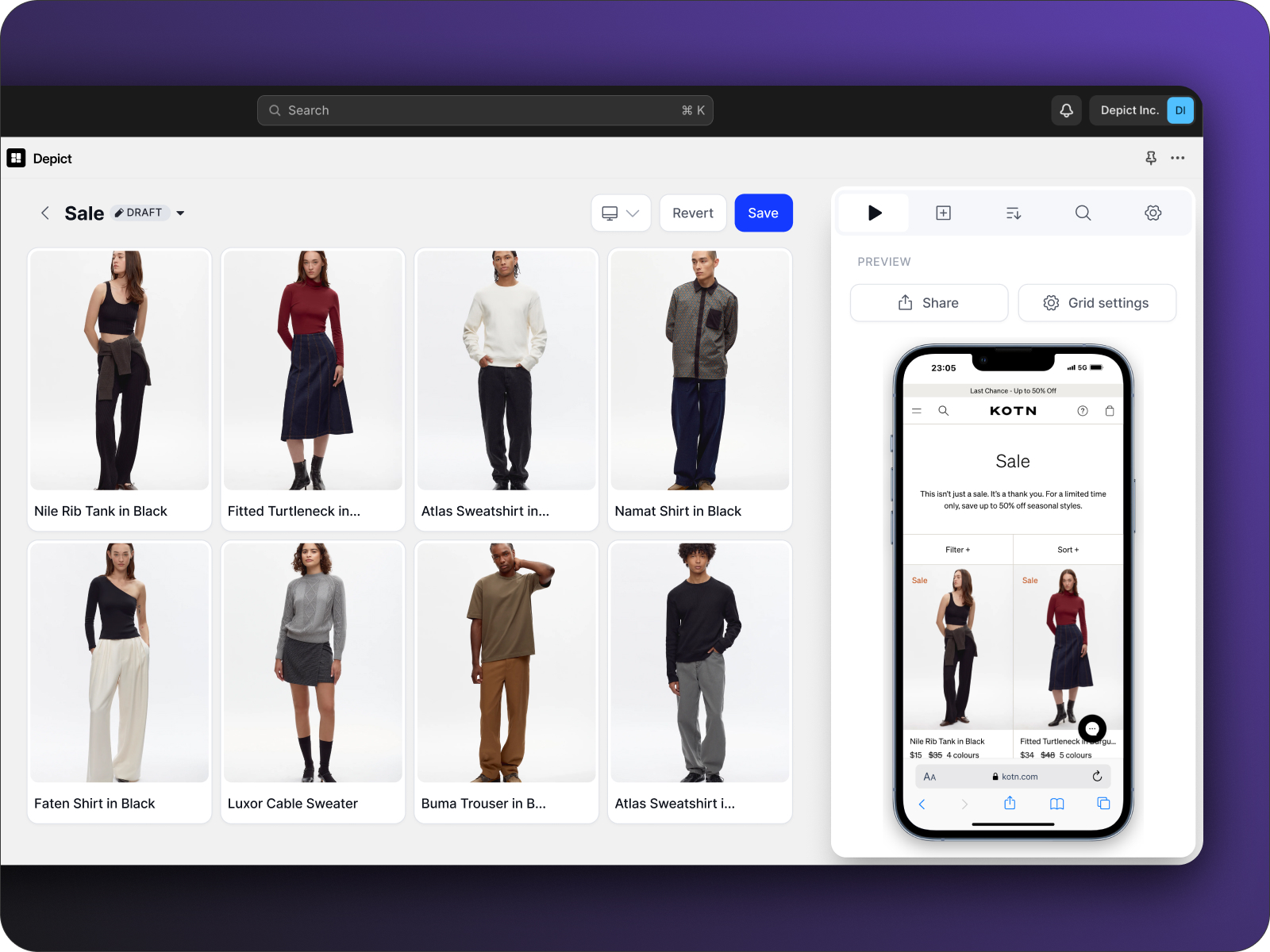
10. Use Depict.ai for Grid Management

Managing grids manually is time-consuming and prone to errors. Depict.ai takes the hassle out of the process by automating grid organization, ensuring your store looks great and performs even better.
Automated Efficiency
Depict.ai simplifies grid management with powerful features:
FeatureWhat It DoesWhy It MattersSmart SortingHighlights top-selling productsBoosts visibility for favoritesStock ManagementPushes out-of-stock items downMinimizes customer frustrationMulti-Device PreviewShows desktop and mobile views in real timeDelivers a consistent experience1-Click SetupNo coding neededSpeeds up implementation
These tools help make your grid more organized and improve conversions.
Real Results from Fashion Brands
Fashion retailers are already seeing major benefits with Depict.ai. Here's what some have to say:
"We're witnessing a substantial improvement in our workflow, tasks that used to take hours are now fully automated."
Another retailer highlights the time savings:
"A work(life)saving app. We saved 40% of our time merchandising every month."
Multi-Store Management
If you manage multiple storefronts, Depict.ai can make a big difference. Lukas Jensen from Ilse Jacobsen shares:
"A game-changer compared to standard Shopify collections, we're operating at lightning speeds across 6 stores."
Implementation Options
Depict.ai offers flexible pricing to suit different business needs:
- Basic: $50/month for up to 25,000 monthly sessions
- Essentials: $250/month with advanced features
- Pro: Starting at $500/month for larger operations
- Custom: Tailored plans for Centra users
You can try Depict.ai for free to see how it works before committing. The no-code setup means you can get started quickly, even without technical skills. Pair Depict.ai with smart grid practices to take your store’s design and performance to the next level.
Conclusion
A well-designed product grid plays a key role in the success of fashion stores, helping create attractive, high-performing storefronts that encourage repeat customers.
Impact on Business Performance and Resources
Fashion retailers who adopt these grid design strategies have seen major improvements in workflows and a noticeable drop in manual merchandising tasks. Combining thoughtful grid design with automation tools simplifies everything - from updating grids to managing inventory and overseeing multiple stores. This leads to smoother operations and saves a significant amount of time.
These time savings allow you to quickly make strategic updates to your grid design when needed.
Getting Started
Focus on these core principles to begin:
- Prioritize Visual Hierarchy: Highlight your key products to grab attention right away.
- Mobile-First Design: Ensure your grids are responsive and look great on all devices.
- Automation Integration: Use tools like Depict.ai to make product grid management easier.
Experts have noted up to 40% time savings in merchandising tasks, alongside improved performance across multiple stores.
